

2026’s colors of painting trends for home decor
As we step into 2026, interior color palettes are evolving beyond simple neutrals and predictable trends. The year’s standout paint colors reflect deeper cultural and emotional shifts — from a desire for well-being and calm to an appreciation of craftsmanship, heritage, and rich, layered color narratives.
For lovers of hand-painted oil art, these colors aren’t just about walls — they open new doors for selecting paintings that harmonize with the spaces we live in and how we feel in them.
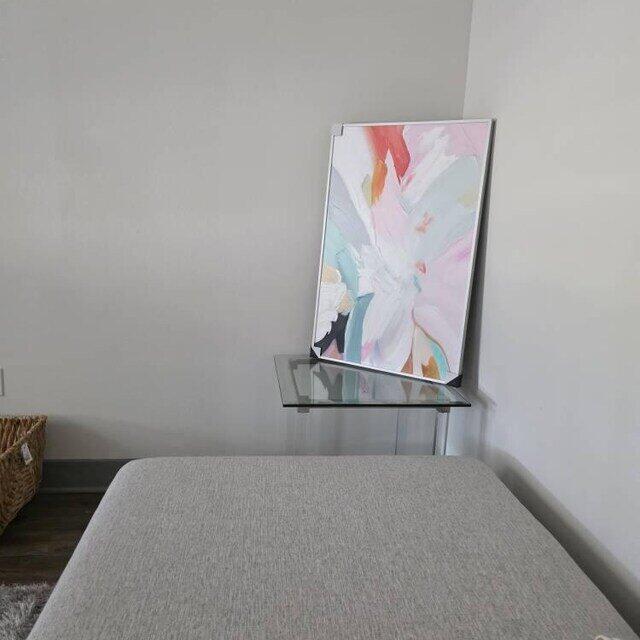
🎨 1. Cloud Dancer — The Breath of Light in Your Space
Pantone’s Color of the Year 2026, Cloud Dancer, isn’t flashy — it’s serene, calm, and feels like a fresh breath of air.
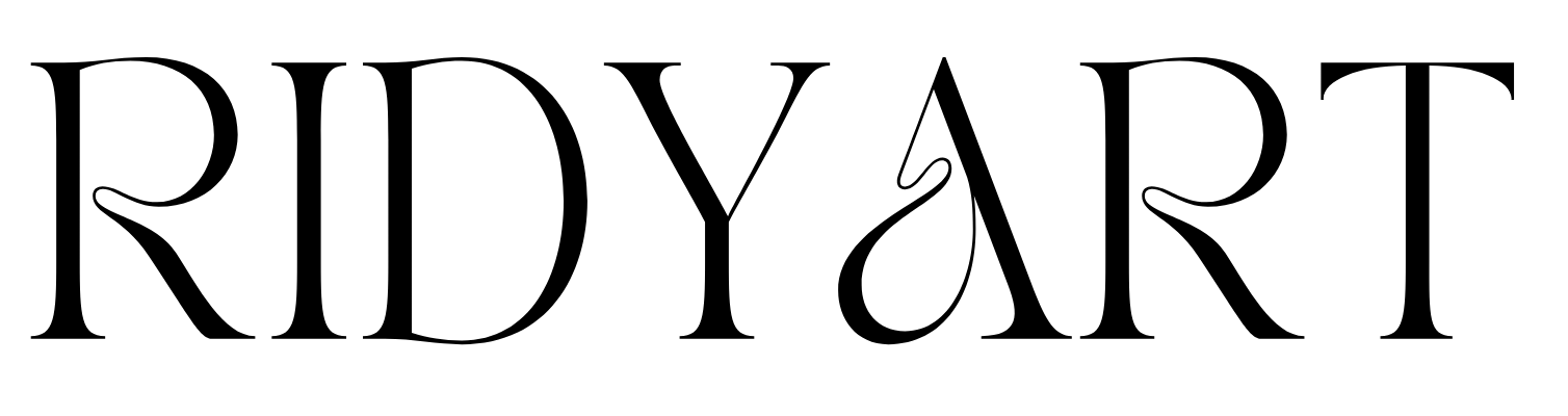
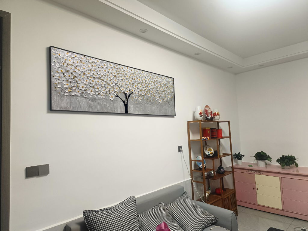
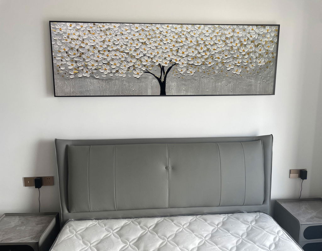
🖼 Art Insight: Paintings that incorporate soft whites, light cream, or subtle off-white tones can beautifully echo this backdrop, letting texture and form take center stage. Think minimalist abstracts or delicate landscapes where light and brushwork create gentle movement.
Best room pairing: Living rooms, modern galleries, and minimalist bedrooms where light and space matter.

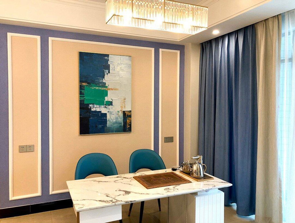
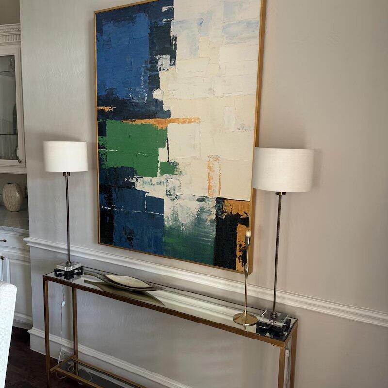
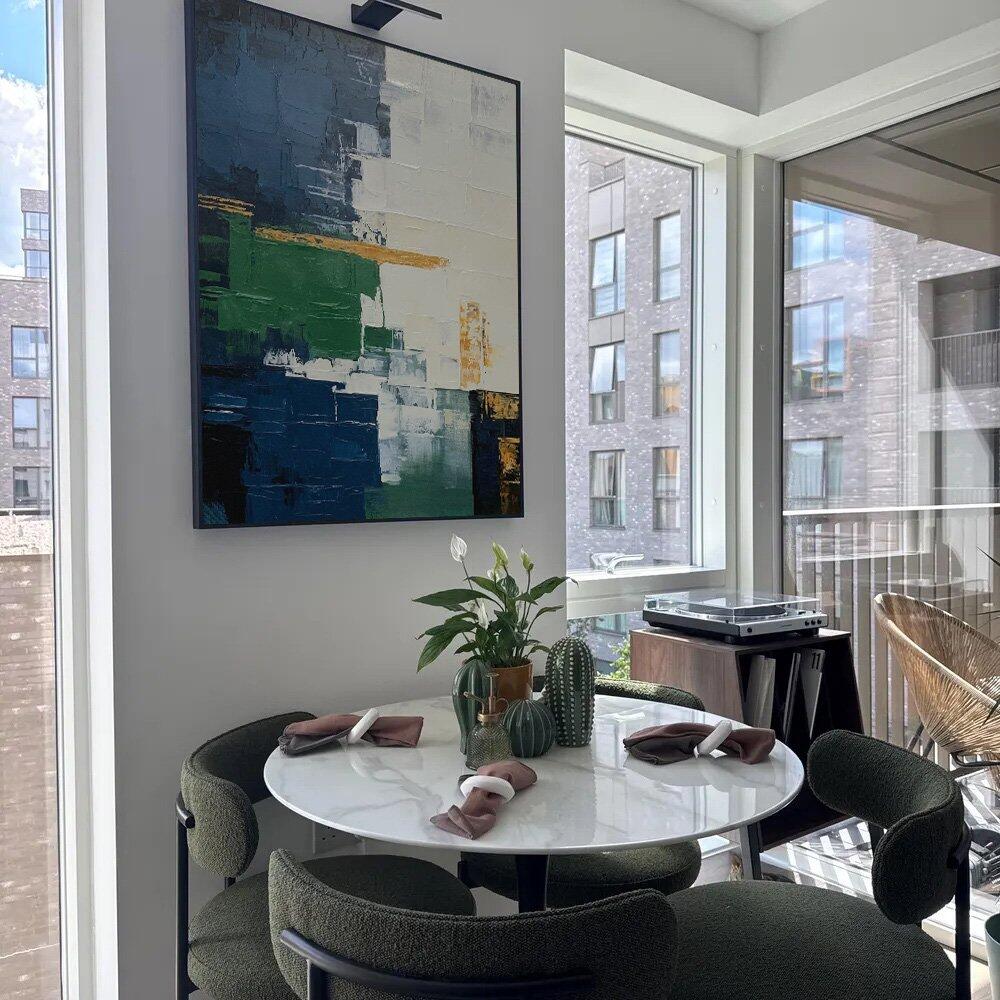
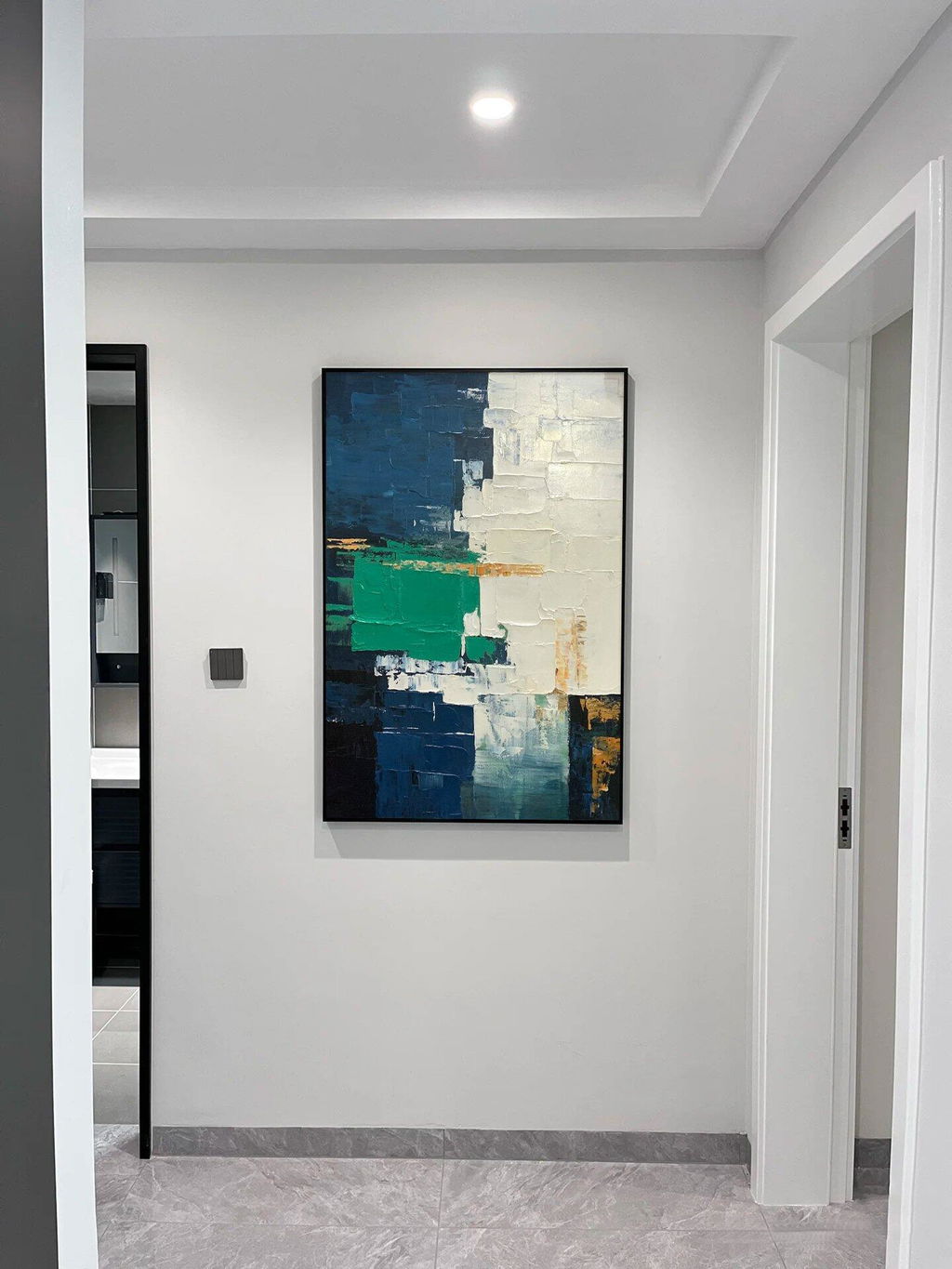
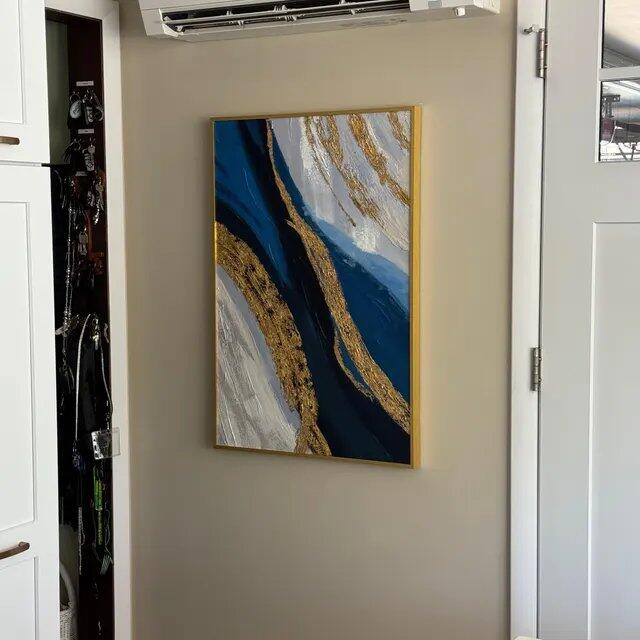
🌿 2. Patina Blue — Smoky Jade: A New Neutral With Soul
Behr’s Hidden Gem blends blue and green into a sophisticated, mineral-like hue that works as a “new neutral” — striking yet soothing.
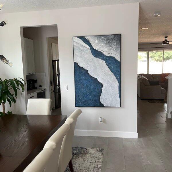
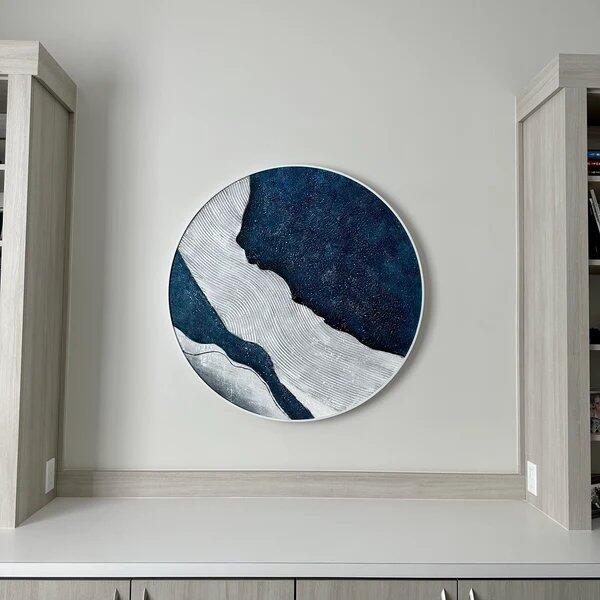
🖼 Art Insight: Oil paintings with deep teal, turquoise, or jade accents tie effortlessly to this trend. Works that incorporate nature themes — coastal scenes, forest interiors, or abstract currents of green-blue — will deepen the connection between art and environment.
Best room pairing: Study nooks, bathrooms, and spaces where calm focus is key.

🌱 3. Iron Gray — Earth-Inspired and Restorative
Valspar’s Warm Eucalyptus channels a restorative, grounded vibe, inviting nature indoors.
🖼 Art Insight: Hand-painted oils with botanical subject matter or earth-toned palettes (deep greens, moss, muted olive) reflect this trend. These hues bring a sense of balance and quiet — perfect when paired with natural materials like wood and linen.
Best room pairing: Reading corners, cozy lounges, and peaceful bedrooms.
☕ 4.
Benjamin Moore—Matte Coffee Bean & Special Walnut — Rich Brown Narratives
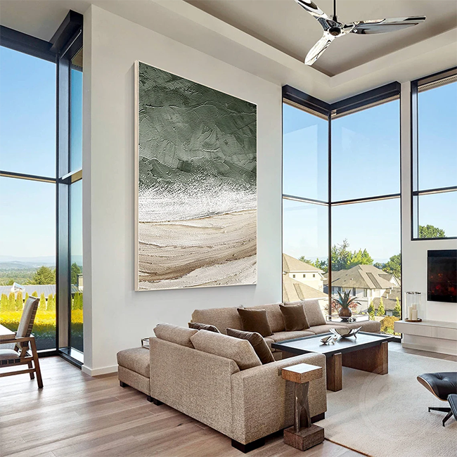
Brown tones like Matte Coffee Bean and Special Walnut evoke warmth, craftsmanship, and an appreciation of heritage.
🖼 Art Insight: Hand-painted pieces featuring burnt sienna, umber, or sepia tones complement these deep neutrals. Whether you paint expressive abstracts or atmospheric landscapes, these hues imbue spaces with depth and comfort.
Best room pairing: Libraries, lounges, and dining rooms with wood accents.

🍷 5. Hidden Gem—Royal Plum & Deep Jewel Tones — Adventurer and Divine Damson
Colors like Adventurer and Divine Damson introduce drama and richness — a bold, personal choice for 2026.
🖼 Art Insight: These deep, regal hues work beautifully in oil paintings with vivid highlights — think moody florals, expressive abstracts with jewel-tone contrasts, or portraiture that revels in dramatic lighting.
Best room pairing: Intimate spaces where emotion and atmosphere matter most.

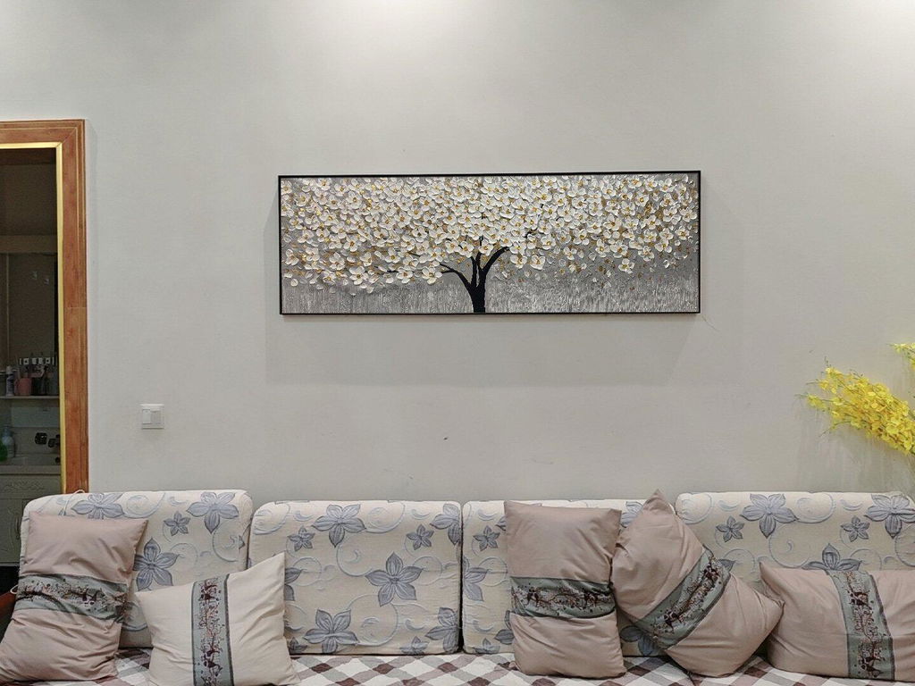
🧱 6. Universal Khaki & Melodious Ivory — Warm, Adaptable Foundations
Universal Khaki and Melodious Ivory are sophisticated, warm bases that work in almost any décor.
🖼 Art Insight: Artworks that incorporate soft beige, cream, or subtle warm undertones pair especially well with these foundations. Consider art that uses light shadow, texture, and tonal gradation to complement an inviting backdrop.
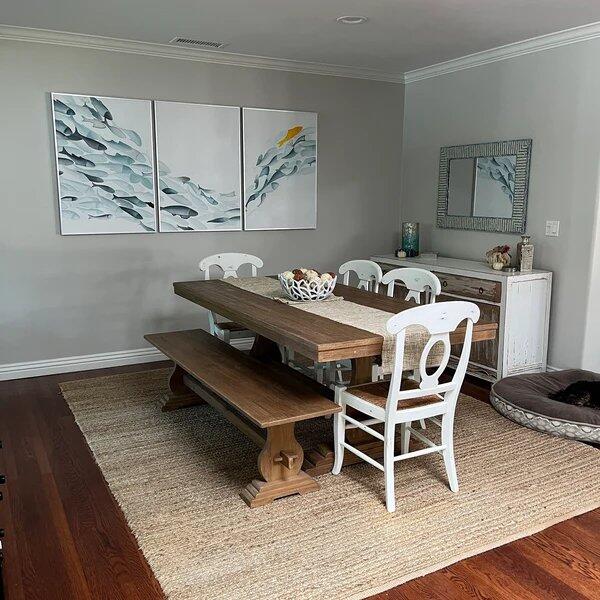
Best room pairing: Hallways, dining rooms, and open plan interiors.

🎯 How to Choose Paintings That Sing With 2026 Colors
Here’s a simple guide to harmonizing your oil art with the year’s most talked-about paint colors:
✨ Contrast & Focus:
Use bold, deep artworks (plum, emerald, espresso) against neutral walls to make your art pop.
✨ Harmony & Calm:
For serene spaces, choose paintings with soft, tonal layers that echo Cloud Dancer, Warm Eucalyptus, or Melodious Ivory.
✨ Statement & Depth:
Rich tones like Hidden Gem and Deep Jewel lend themselves to expressive, dramatic oil paintings with layered brushwork and strong form.
✨ Natural Narrative:
Colors rooted in earth and craft (brown, green, jade) invite landscapes, botanicals, and abstract works inspired by the natural world.
🖼 Final Thoughts
2026’s color trends are rooted in emotion, connection, and craftsmanship — qualities that mirror the essence of hand-painted oil art itself. Whether you’re choosing a signature piece for your living room or curating a gallery wall that feels both current and timeless, these colors offer perfect inspiration.
Selecting art isn’t just about matching a décor trend — it’s about creating moments of feeling in space. And nothing captures mood and meaning like an original oil painting that speaks directly to the heart of your home with Ridyart.


Leave a comment
This site is protected by hCaptcha and the hCaptcha Privacy Policy and Terms of Service apply.