
The Psychology of Color in Wall Art: How Artwork Influences the Feeling of a Room
When decorating a home, color is one of the most powerful design elements. While furniture, lighting, and accessories all contribute to the overall look, artwork often becomes the place where color has the strongest visual impact.
A painting is not only something displayed on a wall. The colors, textures, and details can influence how a room feels and how people experience the space.
Choosing the right wall art colors can help create a home that feels comfortable, balanced, and connected to your personal style.
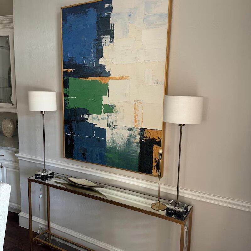
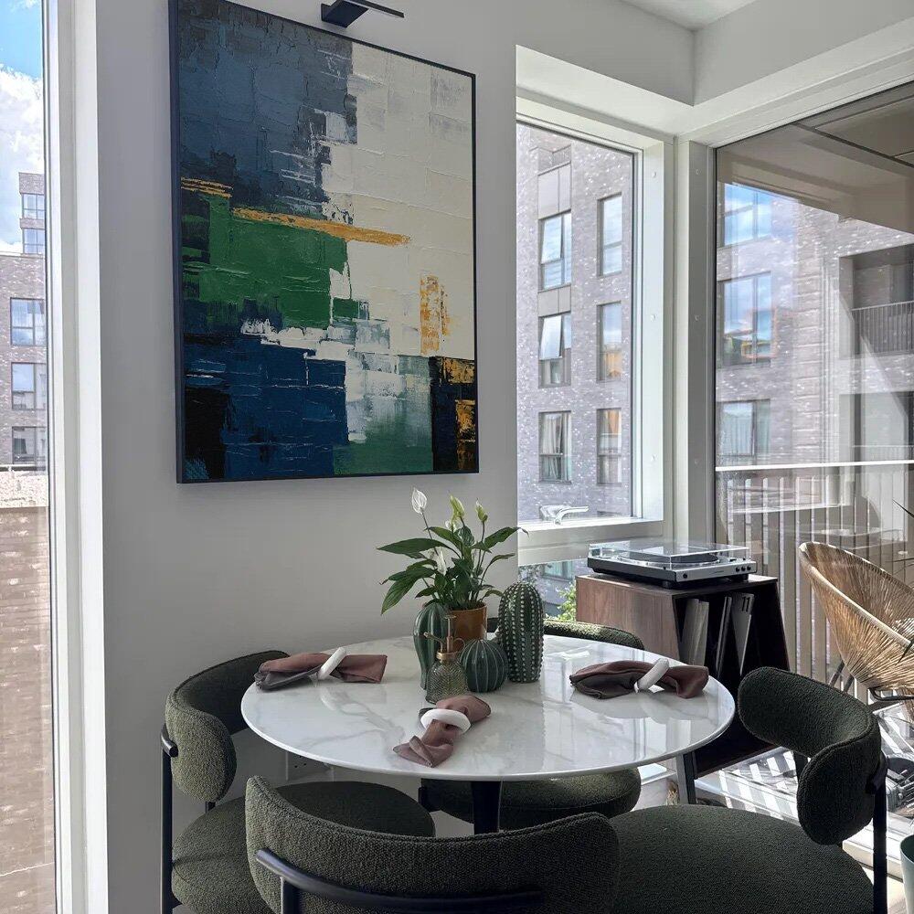
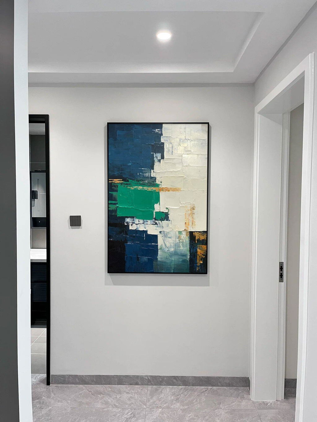
Green Wall Art: Bringing Natural Balance Into Your Home
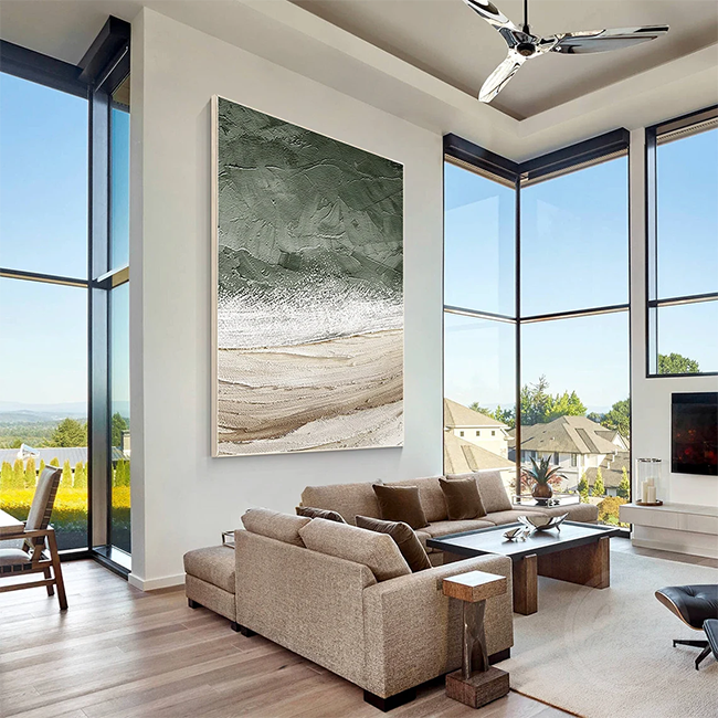
Green has become increasingly popular in modern interiors because it connects indoor spaces with nature.
Green artwork can work beautifully in:
- Living rooms
- Home offices
- Bedrooms
- Reading areas
Soft sage green tones create a gentle natural feeling, while deeper forest greens add richness and depth.
Green abstract paintings are especially versatile because they can complement both modern and organic interior styles.

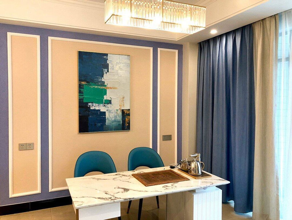
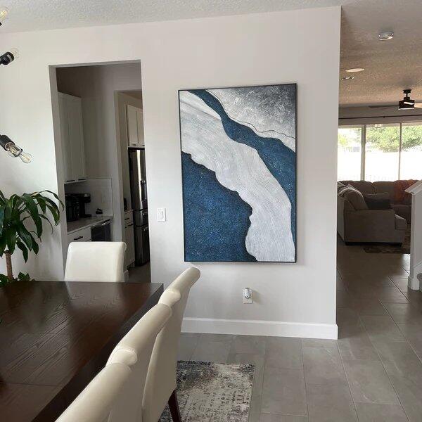
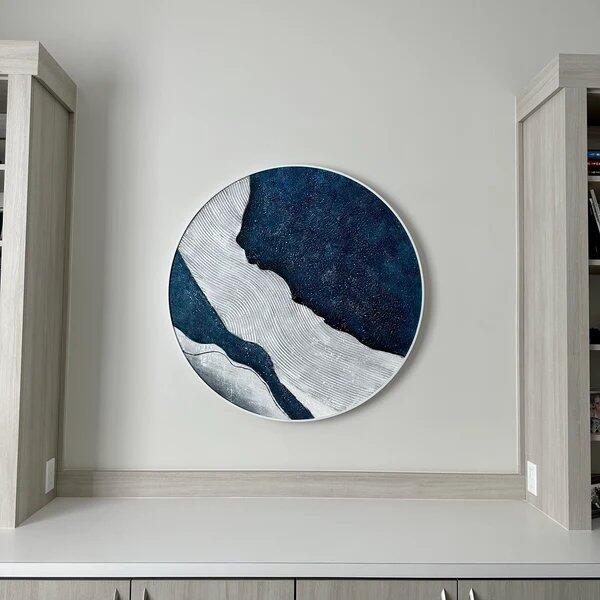
Blue Artwork: Creating a Calm Interior Atmosphere
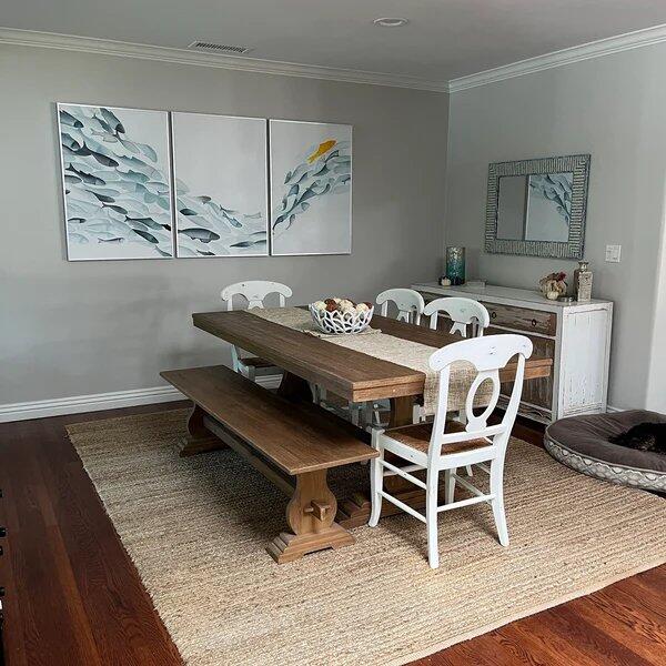
Blue artwork is often chosen for spaces where people want a comfortable and relaxed feeling.
Ocean-inspired paintings, abstract blue artwork, and coastal designs can introduce:
- Soft coastal colors
- A sense of openness
- A connection with natural landscapes
Blue works particularly well with neutral furniture, light wood, and minimalist interiors.

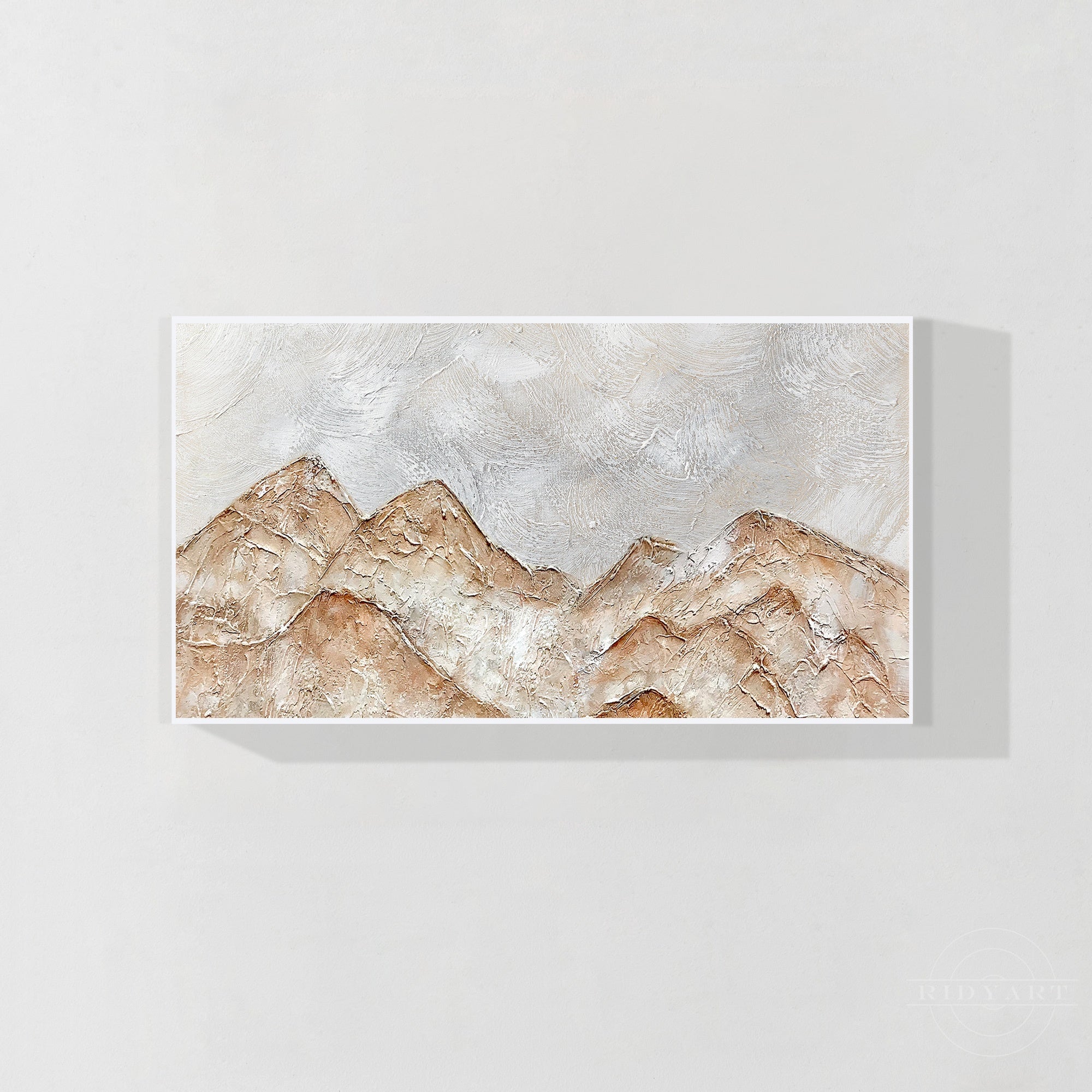
Beige and Earth Tone Artwork: A Favorite for Modern Homes
Neutral artwork has become a popular choice because it works easily with different decorating styles.
Colors such as:
- Beige
- Cream
- Taupe
- Sand
- Warm brown
can create a soft foundation for modern interiors.
Textured neutral paintings add extra depth while keeping the overall appearance simple and refined.

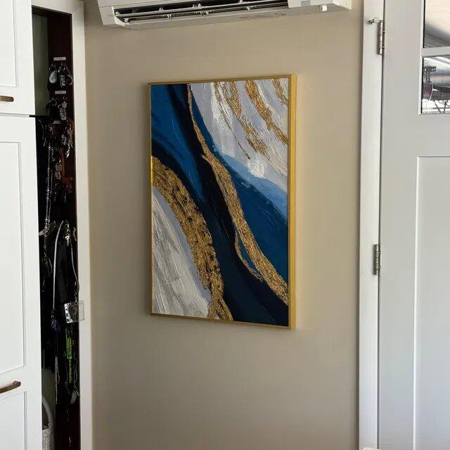
Gold Details: Adding Warm Visual Interest
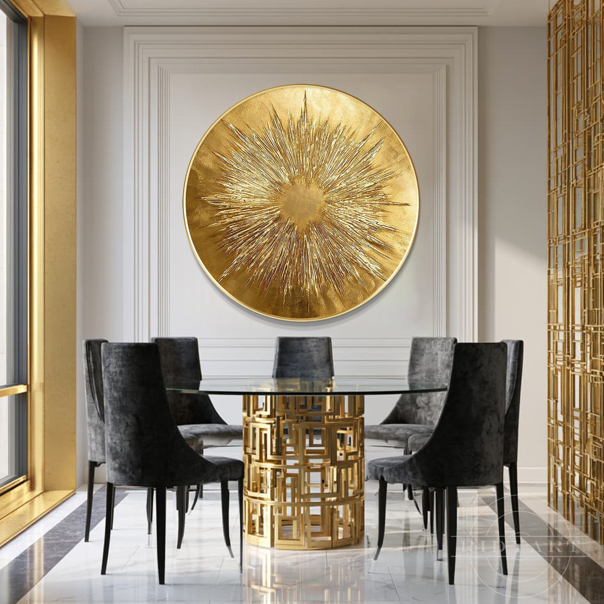
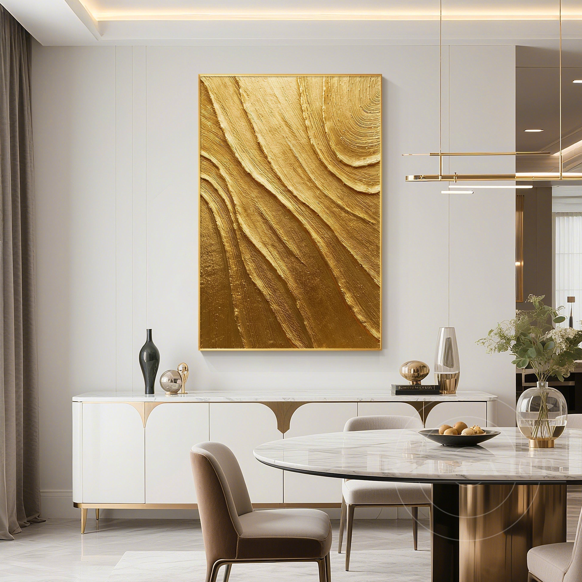
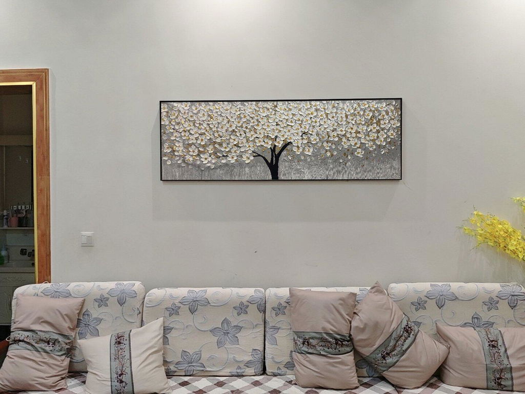
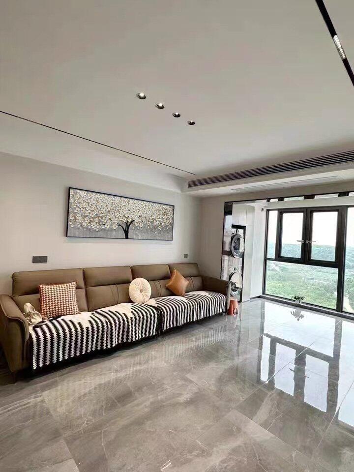
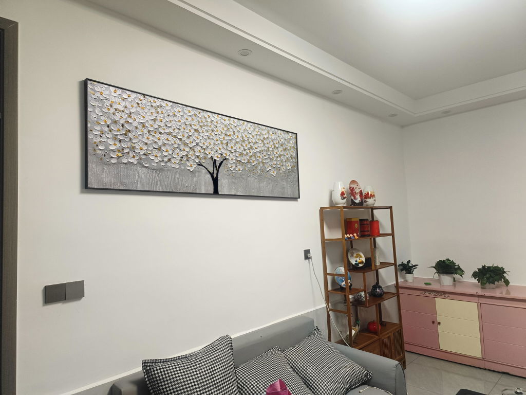
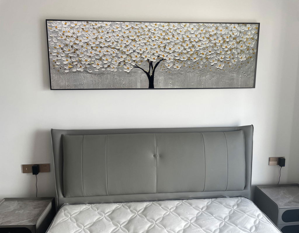
Gold accents in artwork can create a beautiful focal point.
Many contemporary paintings use:
- Gold leaf
- Metallic details
- Gold texture effects
to introduce warmth and highlight specific areas of the artwork.
Gold artwork pairs especially well with:
- Dark furniture
- Neutral walls
- Modern luxury interiors

Choosing Artwork Colors That Match Your Home
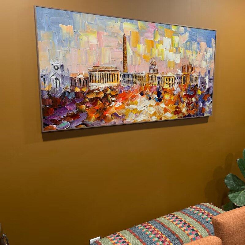
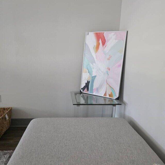
Instead of trying to match your artwork perfectly with your furniture, consider choosing colors that connect with your existing space.
Look at:
- Wall color
- Sofa fabrics
- Rugs
- Decorative objects
- Natural materials
The best artwork often creates harmony through similar tones rather than exact matching.

Final Thoughts
Color plays an important role in how we experience our homes. The right wall art can bring personality, warmth, and visual balance to any room.
Whether you prefer green nature-inspired paintings, peaceful blue artwork, neutral textured designs, or gold accent pieces, choosing colors that connect with your lifestyle can make your space feel more personal.






Leave a comment
This site is protected by hCaptcha and the hCaptcha Privacy Policy and Terms of Service apply.